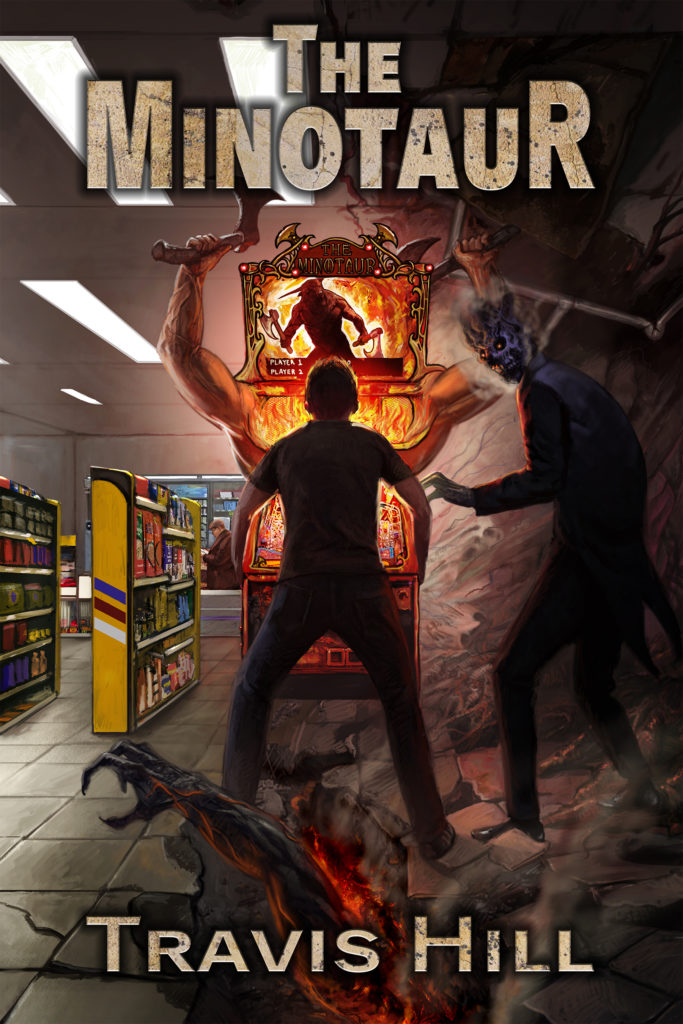
Keith Draws is working on the typography for the cover, so I’ll show you some of what he’s come up with. Let me know which version you like the best!


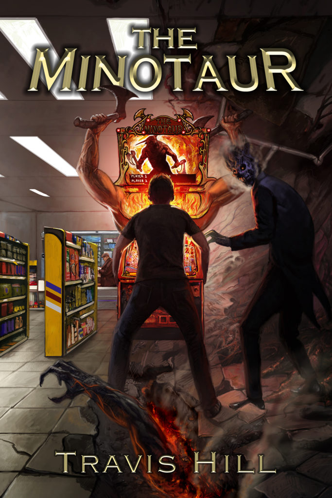

Keith Draws is working on the typography for the cover, so I’ll show you some of what he’s come up with. Let me know which version you like the best!
I think I like the first one the best. I for sure like the axe in front of the ‘N’, and I like the look of the kind of gravely, stone look of the first font.
I like the classic/stone look better as well. I’ll have Keith submit a final cover with the axe in front. Thanks, Nikki!