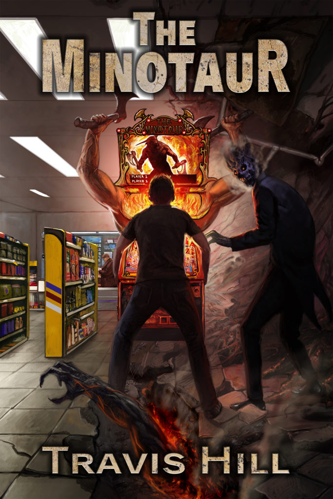
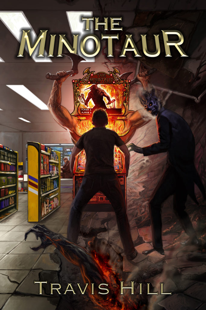
Keith Draws is working on the typography for the cover, so I’ll show you some of what he’s come up with. Let me know which version you like the best!


Keith Draws is working on the typography for the cover, so I’ll show you some of what he’s come up with. Let me know which version you like the best!
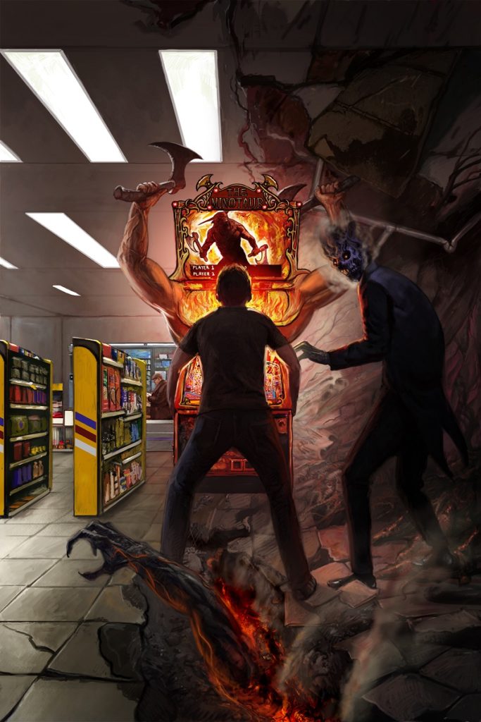
Thanks to Trevor Smith for painting an unbelievably awesome cover for “The Minotaur”!
I originally planned to publish it as a stand-alone novella, as it is only around 20k words, but then an idea popped into my head (a dangerous affair anytime me + ideas collide!), and I’ve decided to make it a collection, but one where all of the stories tie together in a general way: An ancient genie shares stories of how humans foolishly used their wish after releasing him, spanning thousands of years from the Fertile Crescent 6000+ years ago, to a few hundred years in the future.
More on that later. In the meantime, here’s the finished cover!
Hey, all, just got the final version of “The Four Horsemen” cover. T4H is the upcoming sequel/prequel/companion to “Skydark.” Many thanks to Tom Edwards for this awesome cover!
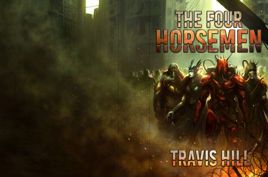
“The Four Horsemen” by Travis Hill
Cover art by: Tom Edwards Designs
Just received an update from Trevor Smith, the artist working on the cover of “End of the Line.” This is NOT a finished piece, just a slight update to show me what some of the aliens look like. They look pretty %#@$! awesome!

“End of the Line” art (WiP)
Many thanks to Rebecca Weaver as she brings this cover to life!
“Hallowed Ends” is a classic fantasy tale of a powerful weapon’s forging in a world about to be plunged into the nightmare of war.
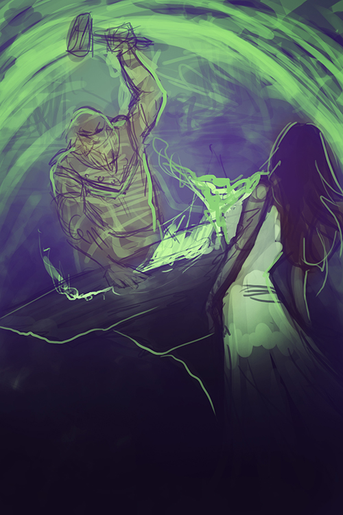
Initial “rough” sketch for “Hallowed Ends” book cover

“Hallowed Ends” book cover, still a Work-in-Progress (but looking fantastic!)
So does anyone remember that old sci-fi movie “Ice Pirates”? One of those ‘so bad it’s good’ space comedies?
I’m kinda toying with a ‘pulp’ idea along those lines. Maybe a series of short novellas written in the pulp style but with modern science fiction ideas. Heck, maybe even some horror stuff too. Street gangs.
I can call it “Dollar Fiction” and then give it a subtitle like “Dollar Fiction: Ice Pirates #1” or something. “Dollar Fiction: Some Other Crap Here #3”. Better yet, I’ll deliberately make them all have plain covers that cost me nothing, and in the blurb, it will say something like “Dollar Fiction’s goal is to give you modern pulp at affordable prices. Our secondary goal is to prove that a book should never be judged by its cover.”
Because I’m never going to stop being annoyed that people still judge the contents of a book by what’s on the cover. It’s ridiculous. How the hell did anyone read some boring shit like “A Tale of Two Cities” when the covers were made of stretched leather or whatever DIDN’T have 4-color, hand-drawn, original artwork (or stock photos pasted together with some lettering on them)?
Have you ever seen what a book looked like before some dude (probably a dude in NYC) decided that paperbacks were easy to make and easy to put all kinds of crazy drawings on the cover? Yeah. Books covers were as artistic as a painted wall.
Continue reading